Want your Help Center to look like the rest of your brand? In the Appearance tab, you can pick your colors and font, add your logos, set up the homepage, the header and the footer, and decide what your customers see on category and article pages.
No code is needed: you change the settings on the left, and a live preview on the right shows you the result straight away - before any of your visitors see it.
In this article, you'll learn:
- How to find the Appearance settings
- How to set your colors, font and favicon
- How to customize your homepage
- How to customize the header and footer
- How to choose what category and article pages show
- How to preview your changes
- How to save your changes
Opening the Appearance tab
Head over to the Help Center section, open the Help Center you'd like to customize, and click on the Appearance tab at the top:
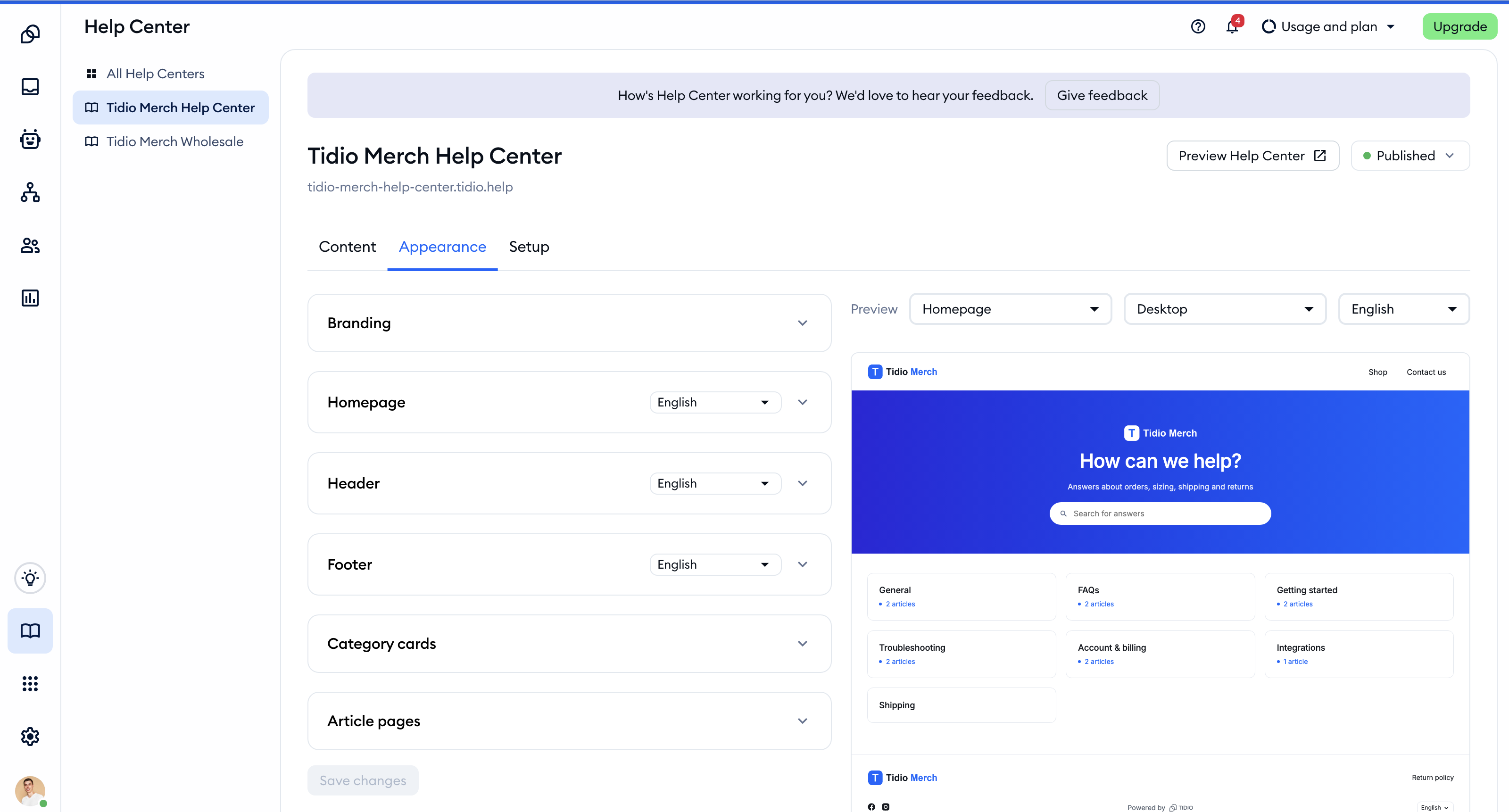
The settings are grouped into six cards: Branding, Homepage, Header, Footer, Category cards and Article pages. They all start collapsed - simply click on a card's title to open it.
Each Help Center has its own appearance, so if you run more than one, you can give each of them a different look.
Please note: the Appearance and Setup tabs are only visible to team members with the Help center settings permission. Without it, you'll only see the Content tab.
Setting up your branding
The Branding card holds the settings that apply to your whole Help Center:
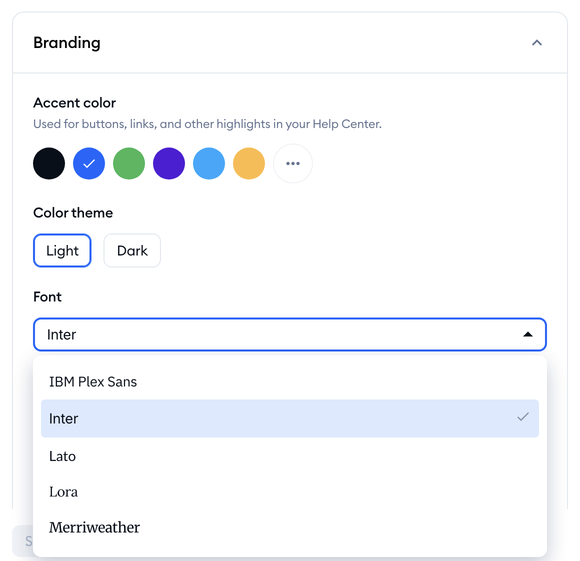
- Accent color - used for buttons, links and other highlights. Pick one of the ready-made colors, or click the three-dots button at the end of the row to choose your own.
- Color theme - choose Light or Dark.
- Font - one font for the whole Help Center, picked from a list of 14 (including Inter, Lato, Roboto, Poppins and Merriweather). Each font in the list is shown in its own typeface, so you can see what you're getting.
- Favicon - the small square image shown in the browser tab.
Your logos are added where they appear: in the Homepage, Header and Footer cards, covered below.
Please note: all images (logos, background images and the favicon) have to be PNG, JPG or WebP files. Logos and background images can be up to 5 MB. The favicon can be up to 1 MB, and it has to be square, at most 512x512 pixels. An image is uploaded as soon as you pick it, but it only appears on your Help Center once you save your changes.
Customizing the homepage
The Homepage card lets you set up the first thing your customers see - the top section of your homepage (the "hero") and the list of categories below it:
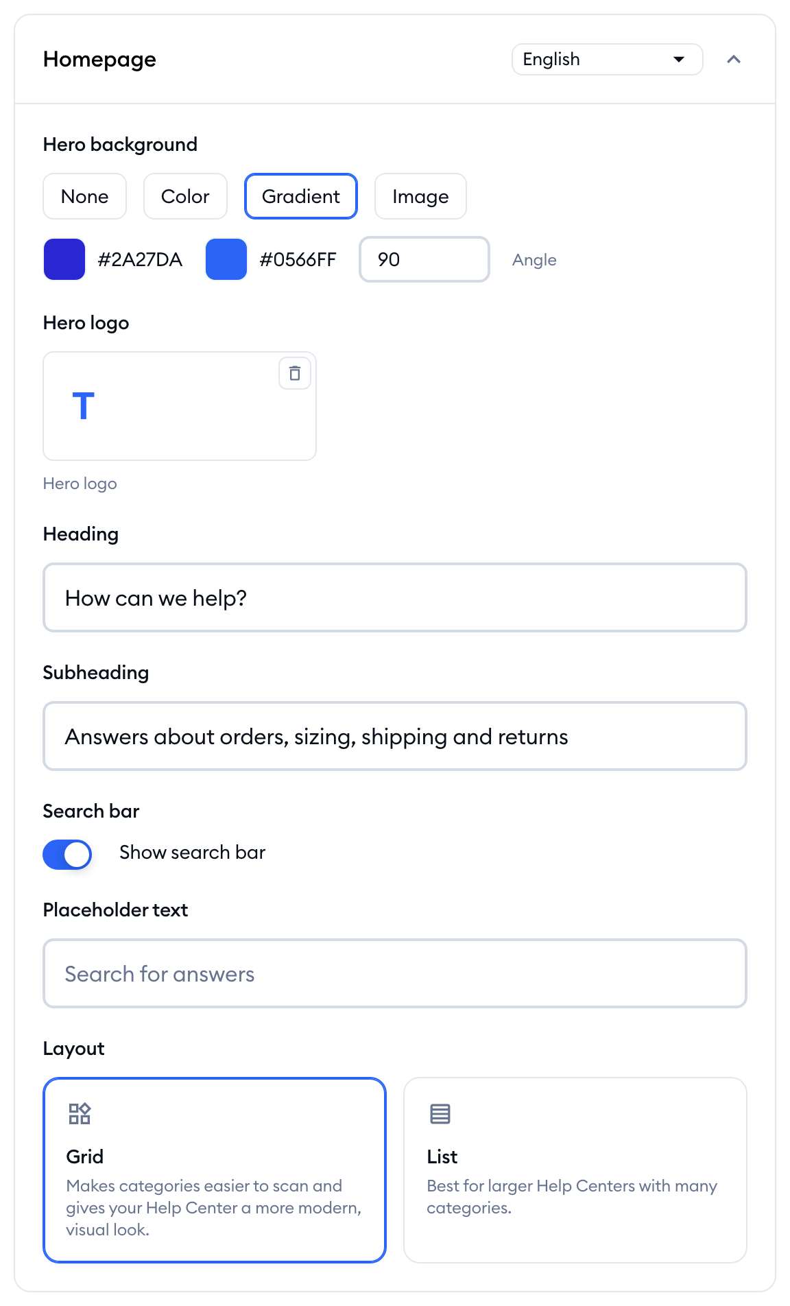
- Hero background - None, a single Color, a Gradient (with a start color, an end color and an Angle), or an Image you upload.
- Hero logo - a logo shown in the hero section.
- Heading and Subheading - the text greeting your visitors, like "How can we help?" and "Find answers quickly".
- Search bar - switch Show search bar on or off. While it's on, you can also change its Placeholder text.
- Layout - show your categories as a Grid (easier to scan, with a more visual look) or a List (best for larger Help Centers with many categories).
In the top-right of the card, you'll also find a language dropdown. If your Help Center is available in several languages, the heading, subheading and search bar placeholder are written separately for each language - simply switch the language and type in the text for it. A dot next to a language in the dropdown means it has unsaved changes. You can learn more about languages in Run your Help Center in several languages.
Customizing the header and footer
The header
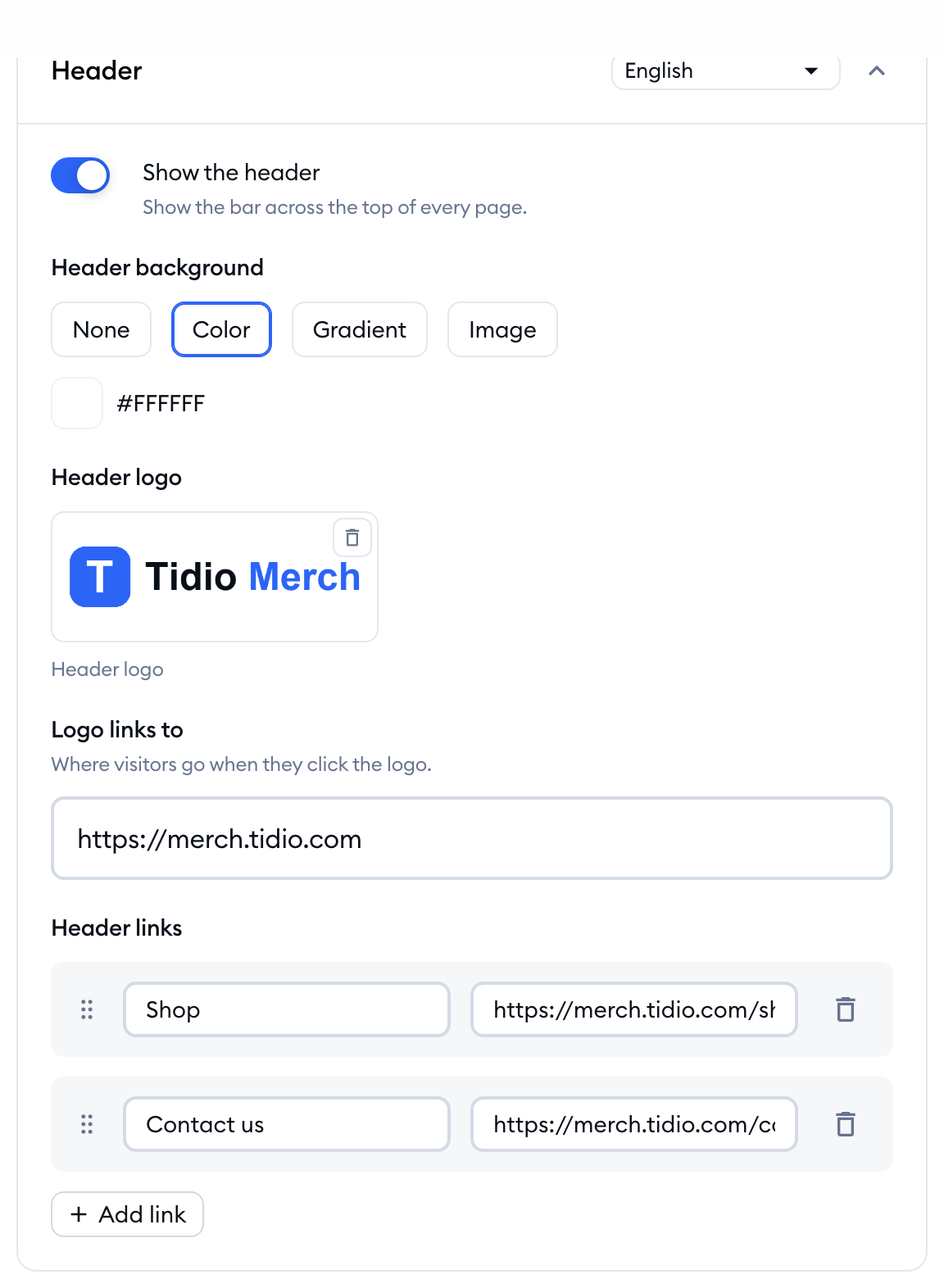
The header is the bar across the top of every page. In the Header card, you can:
- Switch Show the header on or off.
- Pick a Header background (the same options as for the hero: None, Color, Gradient or Image).
- Upload a Header logo, and use Logo links to to decide where visitors go when they click it - for example, back to your website.
- Add your own Header links (like "Pricing" or "Contact us").
To add a link, click on the Add link button, and fill in the Link label and the Link URL. You can drag links by their handle to change their order, or remove them with the trash icon:
Links (including Logo links to) need a full address starting with http:// or https://, or a path starting with /. Labels can be up to 100 characters long. Just like the homepage text, header links are set separately for each language, using the language dropdown on the card.
The footer
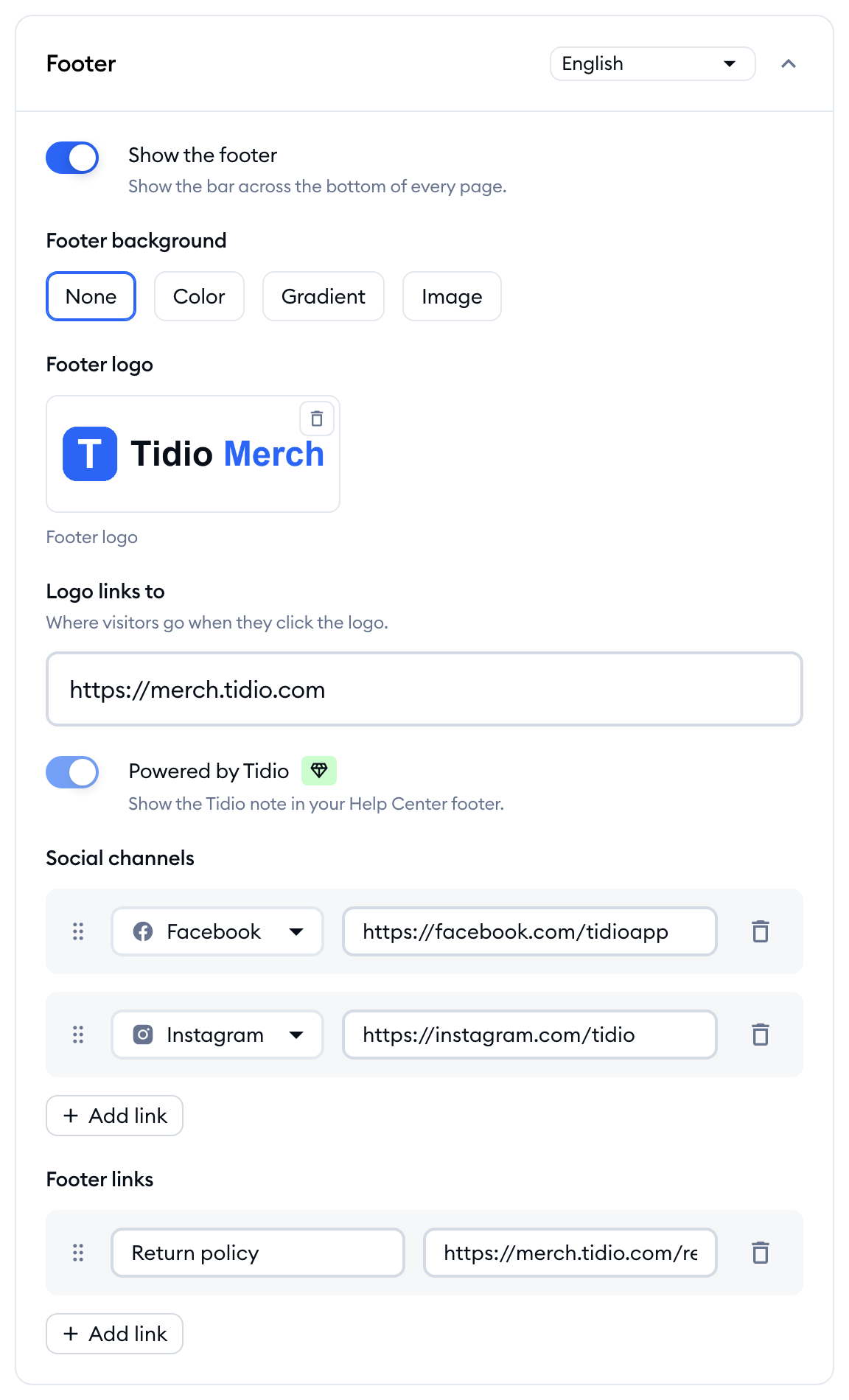
The Footer card works the same way for the bar across the bottom of every page: Show the footer, Footer background, Footer logo with its own Logo links to, and Footer links (set per language).
The footer is also the place for your Social channels. Click on Add link, choose the channel and paste the address of your profile. You can add Facebook, Instagram, TikTok, X, LinkedIn and YouTube - each one once. Social channels are shared by all languages of your Help Center:
Powered by Tidio
By default, your Help Center footer shows a small "Powered by Tidio" note. In the Footer card, the Powered by Tidio switch is locked on - click on it to see how to remove the note with the No Tidio branding add-on. Once your project has it, the row disappears from the card.
Please note: removing "Powered by Tidio" is part of the No Tidio branding add-on, not the Help Center add-on. The same add-on also removes Tidio's branding from your chat widget and email footer.
Choosing how categories and articles look
In the Category cards card, you decide what each category shows on your homepage:
- Show category descriptions - the short description below each category name.
- Show article count - the number of articles in each category.
- Category visual - show each category with an Icon, an Image, or None. Each category's icon is set where you create or edit the category (see Organize articles into categories).
The Article pages card is a set of switches that decide what appears around the text of every article:
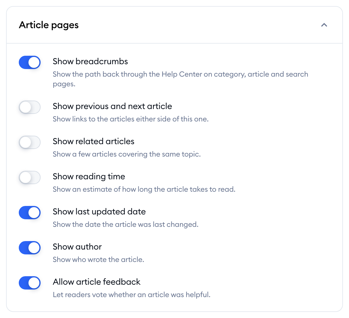
- Help your readers find their way - Show breadcrumbs (the path back through the Help Center, also on category and search pages), Show previous and next article, and Show related articles.
- Tell them about the article - Show reading time, Show last updated date and Show author.
- Ask for their opinion - Allow article feedback lets readers vote whether an article was helpful. You can see the results as described in Article feedback: see which articles help.
Previewing your changes
Every change you make shows up in the Preview on the right right away, even before you save it. Above the preview, you can choose:
- The page: Homepage, Category or Article.
- The device: Desktop, Tablet or Mobile.
- The language you'd like to preview.
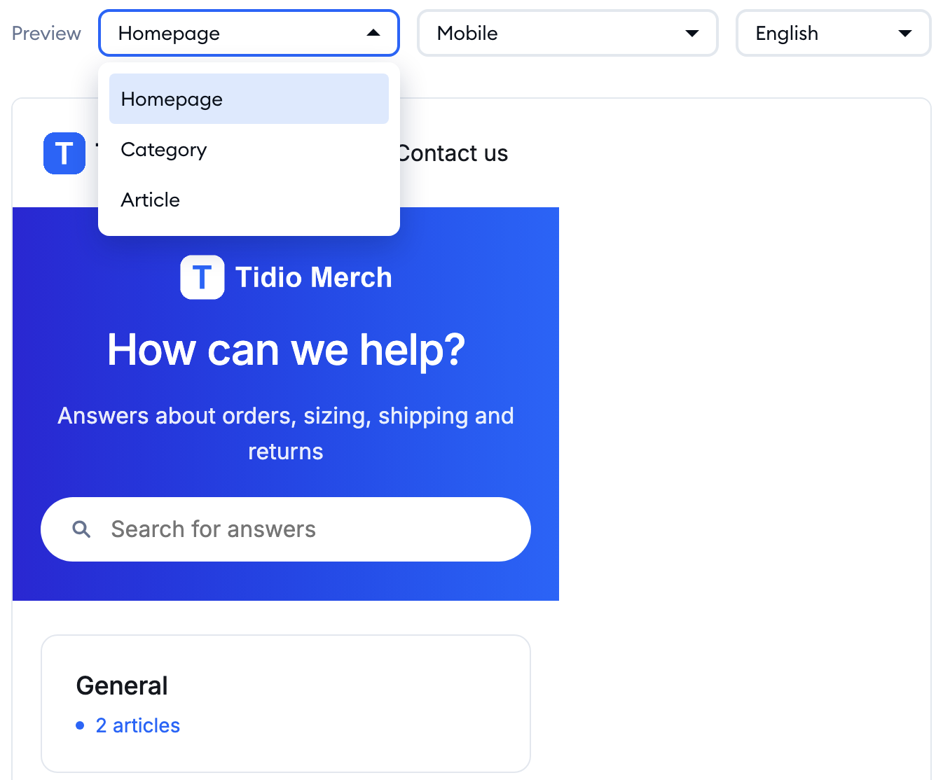
The preview uses your real categories and articles. If your Help Center doesn't have any yet, it shows example content instead, so you can still see how your design will look. You can also click around inside the preview - search and links leading outside your Help Center aren't part of it, and a short message will tell you so.
Saving your changes
Once you're happy with the result, hit the Save changes button at the bottom of the settings. The button stays inactive until you change something. After saving, you'll see a Changes saved confirmation:
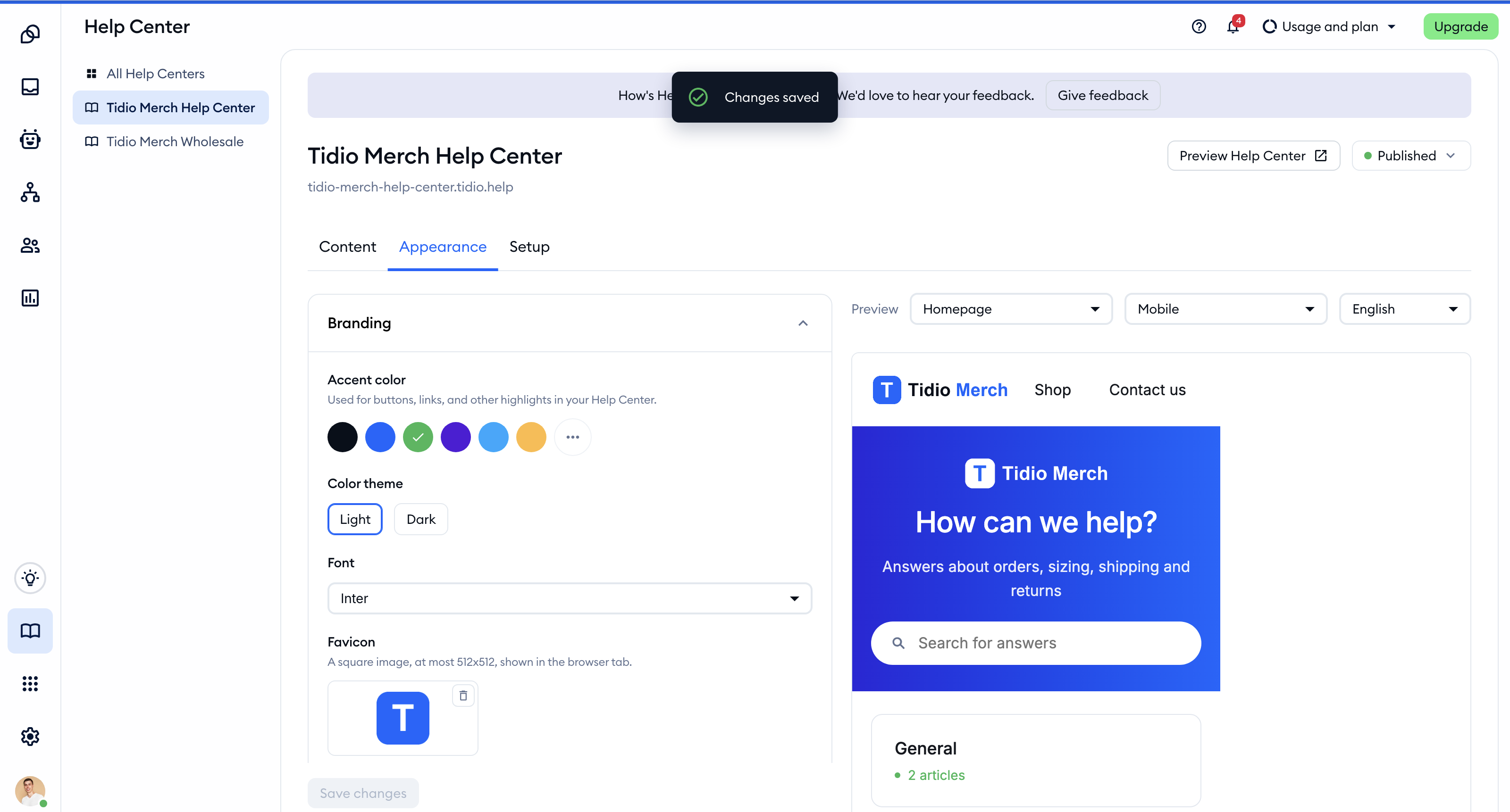
If a link is missing its label or has an invalid address, the button is blocked and a message under it tells you which language the unfinished link is in. Simply finish or remove the link, and save again.
If you try to leave the tab with unsaved changes, Tidio will ask you whether you'd like to Keep editing, Save changes or Discard changes.
Please note: your design can be set up at any time, but your customers will only see it once your Help Center is published. You can read more in Publish, preview and manage articles.